Golf course website
Revitalizing A Golf Club's Online Presence

The old website was clunky, outdated, and failed to deliver an effective user experience. Users struggled to navigate, and the lack of engaging content made it difficult for potential members to see the club's true value.
Pain Points
- Confusing navigation
- Outdated, uninspiring design
- Confusing layout for memberships
- Lack of engaging visuals
The Problem
Enhance customer satisfaction and loyalty by streamlining the website's navigation, making it easier for users to find information and complete tasks without frustration.
The Solution
I created the Aura Beauty app to deliver a more inclusive online shopping experience. By offering accurate skin tone matching and personalized recommendations, users of all complexions can feel empowered to find and purchase makeup with confidence.
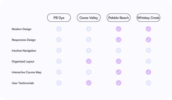
Competitive Analysis
Before conducting user interviews, I analyzed competitors' websites to understand industry standards, identify best practices, and find opportunities to differentiate PB Dye Golf Club’s site in a competitive market.
User Interviews & Survey
I interviewed 6 participants, all of whom are golfers. Among them, 2 had never used the website, while the other 4 had varying levels of familiarity. The diverse perspectives provided valuable insights into first-time user impressions and the experiences of returning users.
CONFUSING NAVIGATION
"
“I couldn’t figure out where to go to find basic information.”
OUTDATED DESIGN
"
“The visuals don’t reflect the quality of the golf course.”
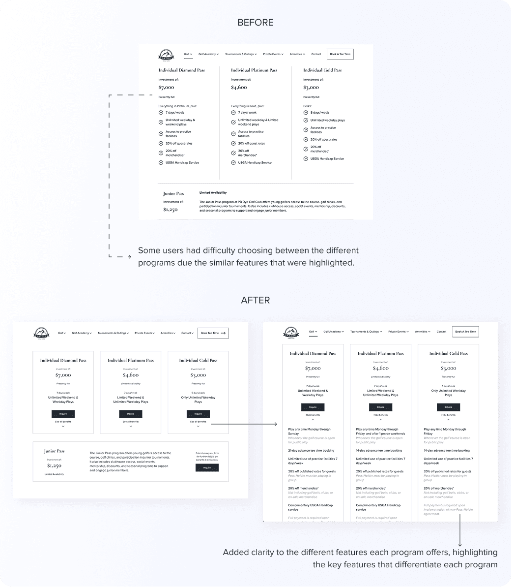
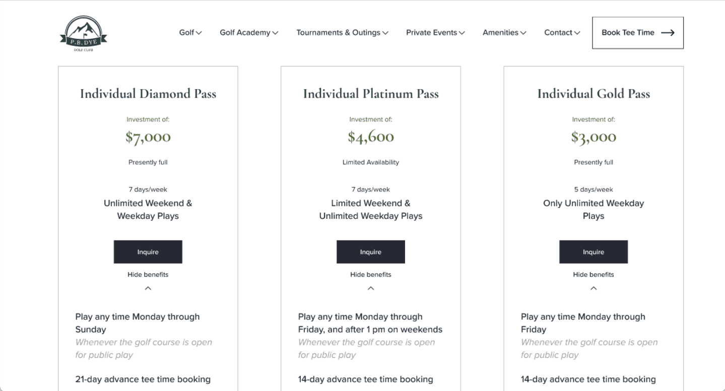
INSUFFICIENT MEMBERSHIP DETAILS
"
"It’s hard to compare memberships with this layout."
Key Takeaways
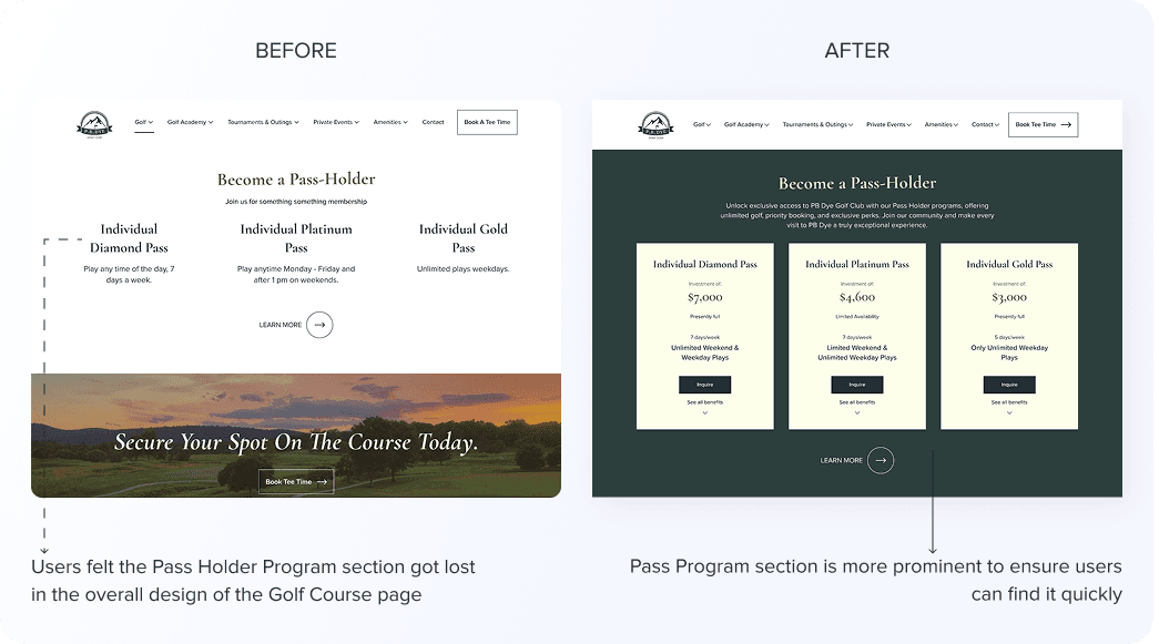
Users wanted clearer membership details, including pricing and benefits, without contacting the club.
RestructURing the sitemap
To fix the navigation, I reorganized the site’s structure using a card-sorting exercise. This involved real users grouping content in ways that made sense to them. The result was a streamlined sitemap that better aligned with user expectations.

Usabiilty Testing
The user interviews and surveys highlighted the need for more accurate, personalized, and inclusive beauty AR experiences. Many users struggled with unrealistic product placement and found it hard to trust virtual try-ons, especially when it came to matching their skin tone. These insights were crucial in showing how improving accuracy and representation could boost user confidence and make online beauty shopping feel more personalized and trustworthy.
Testing Results

iterate, iterate, iterate


This project focused on transforming user frustrations into a seamless, engaging experience. By prioritizing real user feedback, I redesigned the site to be intuitive, visually appealing, and easy to navigate—striking a balance between business goals and user needs.
Balancing Business & User Needs
Finding the right balance between meeting business goals and enhancing the user experience was crucial in designing a site that attracts and converts potential members.
Iterative Design Process
Competitive analysis, user research, and usability testing reinforced the importance of refining designs based on real user feedback to create an intuitive and effective final product.